
This section goes through what’s actually in the tabs ServerIQ shows. Each tab answers a different question about your server – and a couple of them answer a question that isn’t quite the one you’d expect. We’re going to walk through all of them: what each graph is measuring and the handful of readings that look alarming but aren’t.
Tip
If you haven’t found the dashboard yet, start with What Is ServerIQ and How Do You Access It? and come back here.
Three Things That Are True of Every Graph
Before we go tab by tab, there are three habits worth picking up. They apply everywhere on the dashboard.
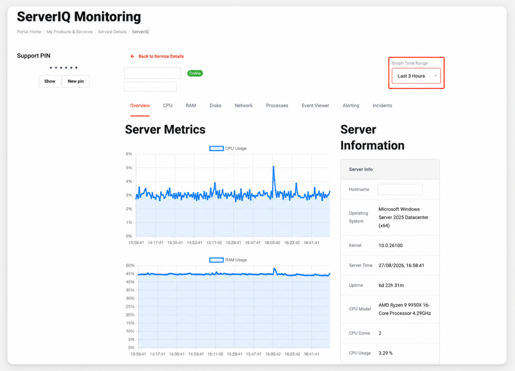
The time range is yours to set. The Graph Time Range selector in the top right controls how far back every graph reaches — from Last 5 Minutes out to Last 7 Days. It opens on Last 3 Hours. If you’re investigating something that happened yesterday, widen it first, or you’ll be staring at a graph that doesn’t contain the moment you care about.
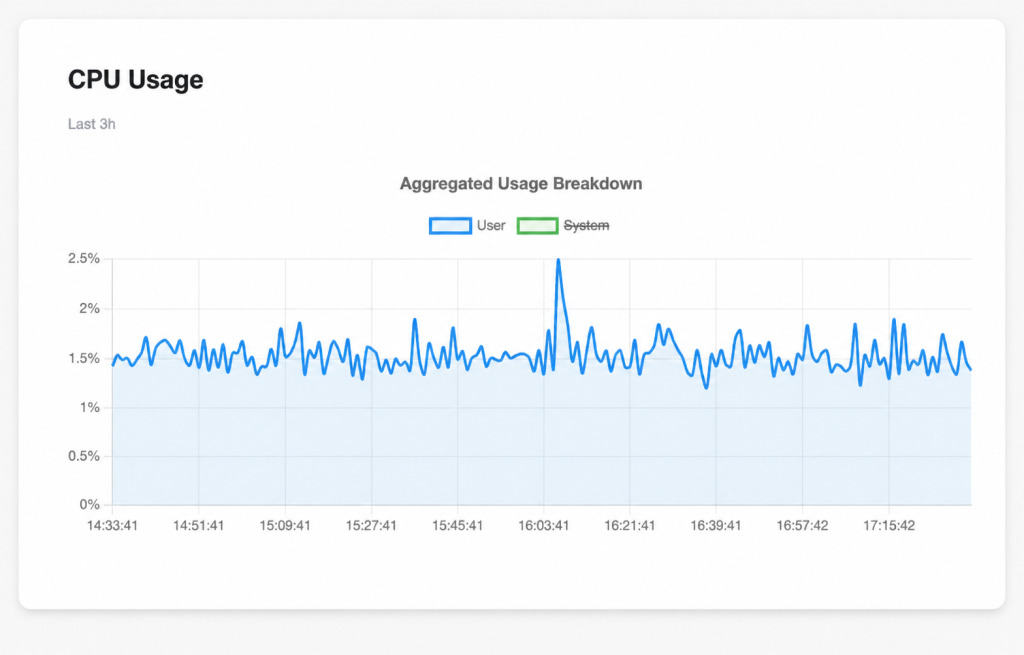
The legend items are buttons. Click any label beneath a chart and that series disappears, struck through in the legend. Click it again and it comes back. On a busy chart, hiding one line to look properly at the other is the quickest thing you can do.
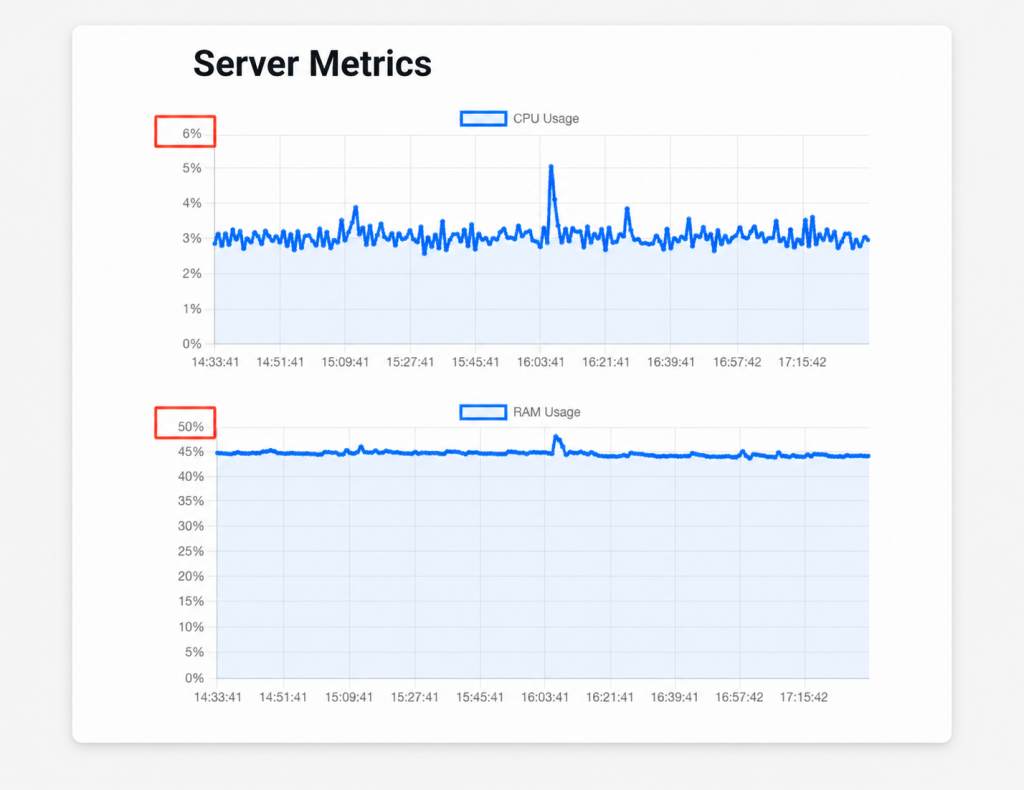
Every chart scales its own vertical axis. Each graph fits itself to whatever data it’s holding, so one chart might top out at 20% and the one directly beneath it at 100% – and at a glance they’ll look identical. Always read the numbers on the left before comparing two charts side by side.
Overview
The landing tab, is the one to check first when you just want to know whether everything’s behaving properly.
On the left, under Server Metrics, three charts sit together: CPU Usage, RAM Usage and Network Throughput (Total). They’re the condensed version of the CPU, RAM and Network tabs – handy for a quick glance, and the place to start before you go digging.
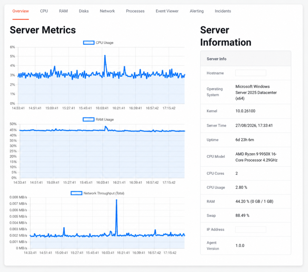
On the right, Server Information gives you the specifications and current state of your server: hostname, operating system and kernel version, the server’s own clock, uptime, CPU model and core count, current CPU and memory usage, your IP address, and the version of the ServerIQ agent doing the reporting.
Two lines in that panel look like they contradict each other, but they don’t. CPU Model names the physical processor your server runs on – a 16-core Ryzen 9, while CPU Cores tells you how many cores are allocated to your plan. Seeing “16-Core Processor” next to “CPU Cores: 2” isn’t an error, and it isn’t you being short-changed. The cores on your plan are dedicated to you.
Note
CPU
Where you go when something feels slow.
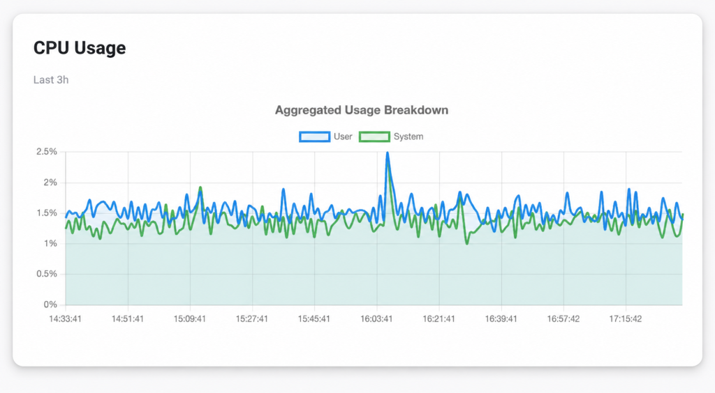
Aggregated Usage Breakdown shows your server’s overall CPU usage over time, split into two series: User and System. User is the time spent running your own software; your trading platform, your indicators, your strategies, a backtest chewing through history. System is time spent inside Windows itself, handling things like disk and network activity on your behalf.
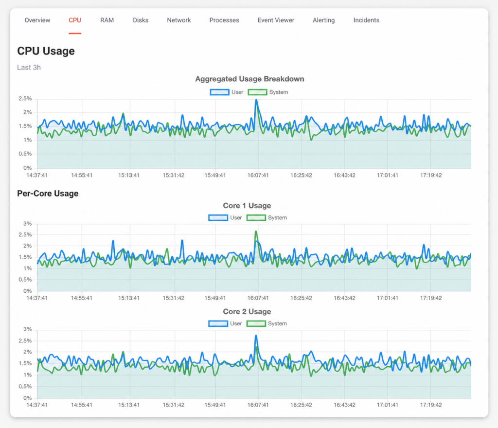
Below that, Per-Core Usage breaks the same picture out into one chart per core, so you can see whether the load is spread evenly or landing on a single core. That matters more than it sounds: plenty of trading software is single-threaded, which means it can saturate one core completely while the others sit almost idle.
RAM
Two charts, both measured in MB. RAM Usage tracks how much memory your server is using over time. SWAP Usage tracks the pagefile.
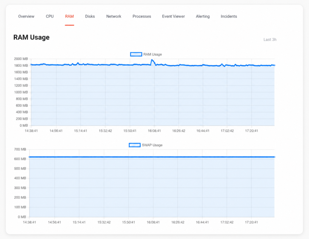
Worth knowing: the Overview tab reports memory as a percentage, while this tab charts it in MB. Same memory, different units.
Disks
Two tables and a chart. File Systems lists each volume with its mount point, file system type, total size, how much is used, how much is free, and used as a percentage. Disks lists the underlying drives with their type, name, size, and serial number. The chart, Disks Usage, tracks that used percentage over time.
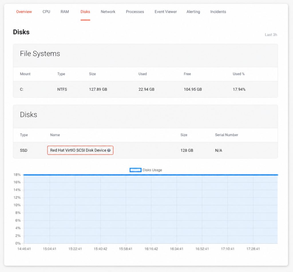
This chart is about space, not speed. It shows how full your disk is getting – not how fast it’s reading and writing.
Note
Your disk will most likely show up under a name like Red Hat VirtIO SCSI Disk Device, with N/A for a serial number. That’s the virtual storage driver announcing itself, which is simply how a virtualised disk reports its own identity.
Tip
You may also notice the size reading slightly under the number on your plan – 127.89 GB rather than 128 GB, for instance. That’s formatting overhead, not missing space.
If this tab is looking crowded, we’ve got a whole article on what tends to fill a VPS up and how to claw the space back: VPS Disk Space Running Out Unexpectedly.
Network
One chart: Network Throughput (Total), measured in MB/s. It shows how much data your server is actually moving – market data coming in, orders going out, updates downloading, your Remote Desktop session itself.
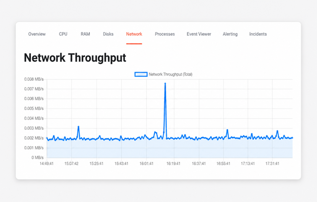
This tab does not measure latency. It’s the first thing most traders come looking for, so it’s worth saying plainly: ServerIQ tracks how much data is moving, not how quickly it reaches your broker or exchange. There’s no ping, no round-trip time and no packet loss figure here. If you’re investigating a latency question, that’s one for our support team rather than this graph.
Alert
Keep an eye on the units. This chart is in megabytes per second, while network speeds are sold in gigabits per second — and they’re not the same measure. 1 Gbps works out to roughly 125 MB/s, so a 10 Gbps connection is somewhere near 1,250 MB/s at full tilt. If your chart is peaking at 0.05 MB/s, that’s not a slow connection. It’s a connection barely being asked to do anything.
Tip
Processes
Running Processes is a live list of everything your server is running right now, whether you’re connected or not. Each row gives you the process PID, its Name, the Command behind it, its CPU % and Memory %, and when it Started. There’s a search box for finding something specific, a control for how many rows to show at a time, and a sort dropdown that opens on CPU % (High to Low).
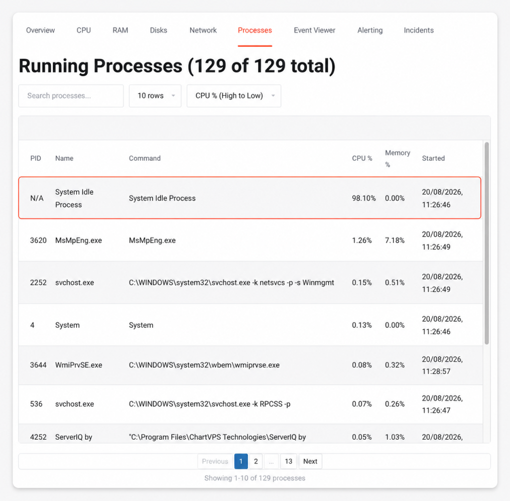
The first row is going to alarm you, and it shouldn’t. On a healthy server, the top entry is almost always System Idle Process, sitting at something like 98% – that isn’t your server being hammered. It’s how Windows accounts for CPU that nothing is using. A System Idle Process at 98% means your server is 98% free. It sits at the top of this list precisely because everything is fine.
Warning
Event Viewer
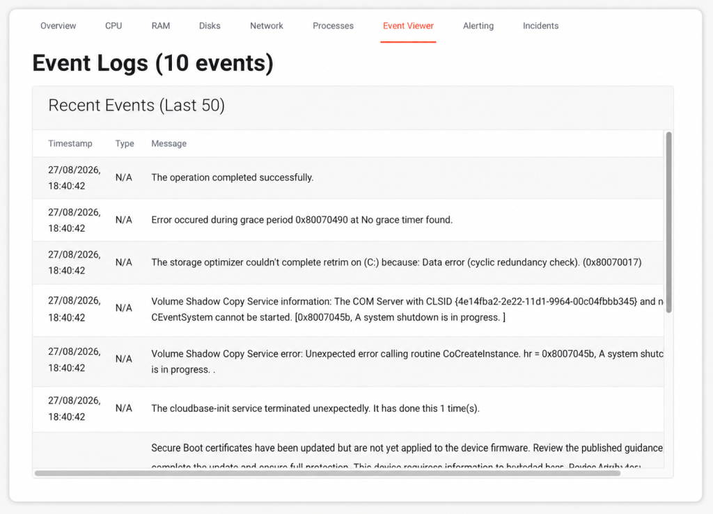
Event Viewer surfaces recent entries from your server’s Windows event logs, so you can glance at them without connecting to the server first.
Two things to set expectations. Event logs accumulate more slowly than the other metrics, so on a freshly built server, this tab will be empty for a while – that’s normal, not a fault. And most of what lands here is routine boot and shutdown chatter: services starting, services stopping, Windows housekeeping. Alarming-looking wording is common and usually means nothing, but can be helpful when exploring what caused an issue, as we can explore the logs around the time of the event to get more context.
What About Alerting and Incidents?
Those two tabs are where ServerIQ stops watching and starts telling you – the rules that decide when you get an email, and the record of every time one of them fired. They’ve earned an article of their own, you can read more about these sections here: How to Set Up ServerIQ Alerts
Not finding what you’re looking for? Get in touch with our highly experienced support team – we’re around 24/7. Checking on a live issue? Take a look at our current system status.
Tip